Variogram
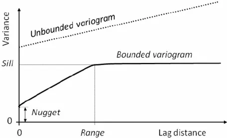
Figure 1:Example of Variogram. [Source: Medium]
This can be used to assess the strength of a the spatial dependencies given a kernel function.
Correlogram
This figure is used to give us an idea of some of the patterns we can expect to see in multivariate data.
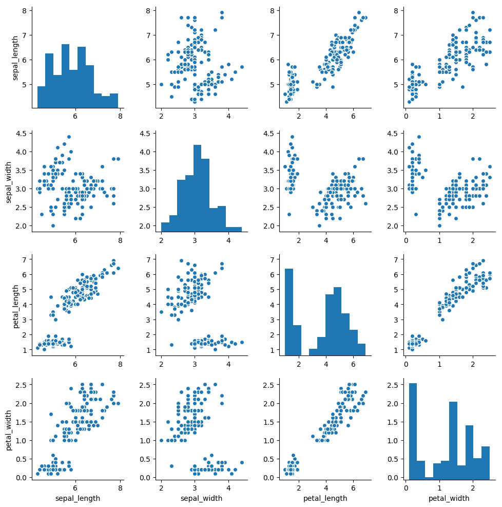
Example of a Correlogram. [Source]
We have some additional variations we can use to try and describe the data better. For example, we can try to fit linear relationships between each of the variables (see example). We could also color-code some of the data points if they belong to a specific category (see example). Lastly, we could customize the assumed distribution in the diagonals (instead of histograms) (see example).
Autocorrelation
We can look at the autocorrelation between the time periods.
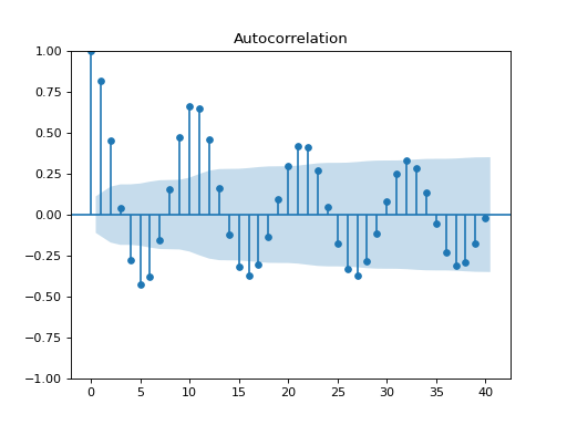
Example of a Correlogram. [Source | statsmodels]
We can extend this to the partial autocorrelation function (see example).
Cross Correlation
We can look at the cross correlation between two time series of different variables.
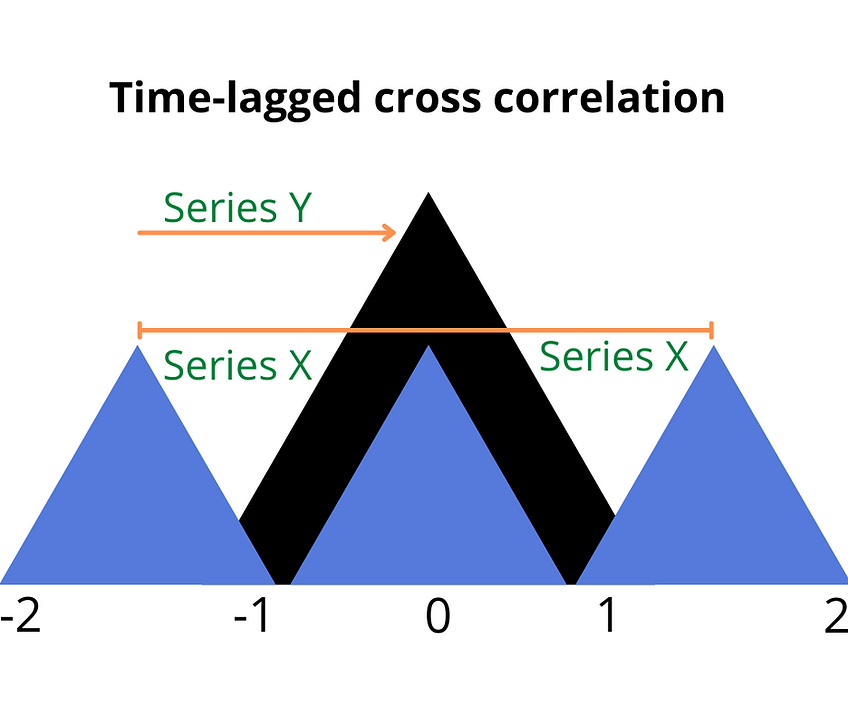
Example of a Correlogram. [Source | matplotlib]
Seasonal Decomposition
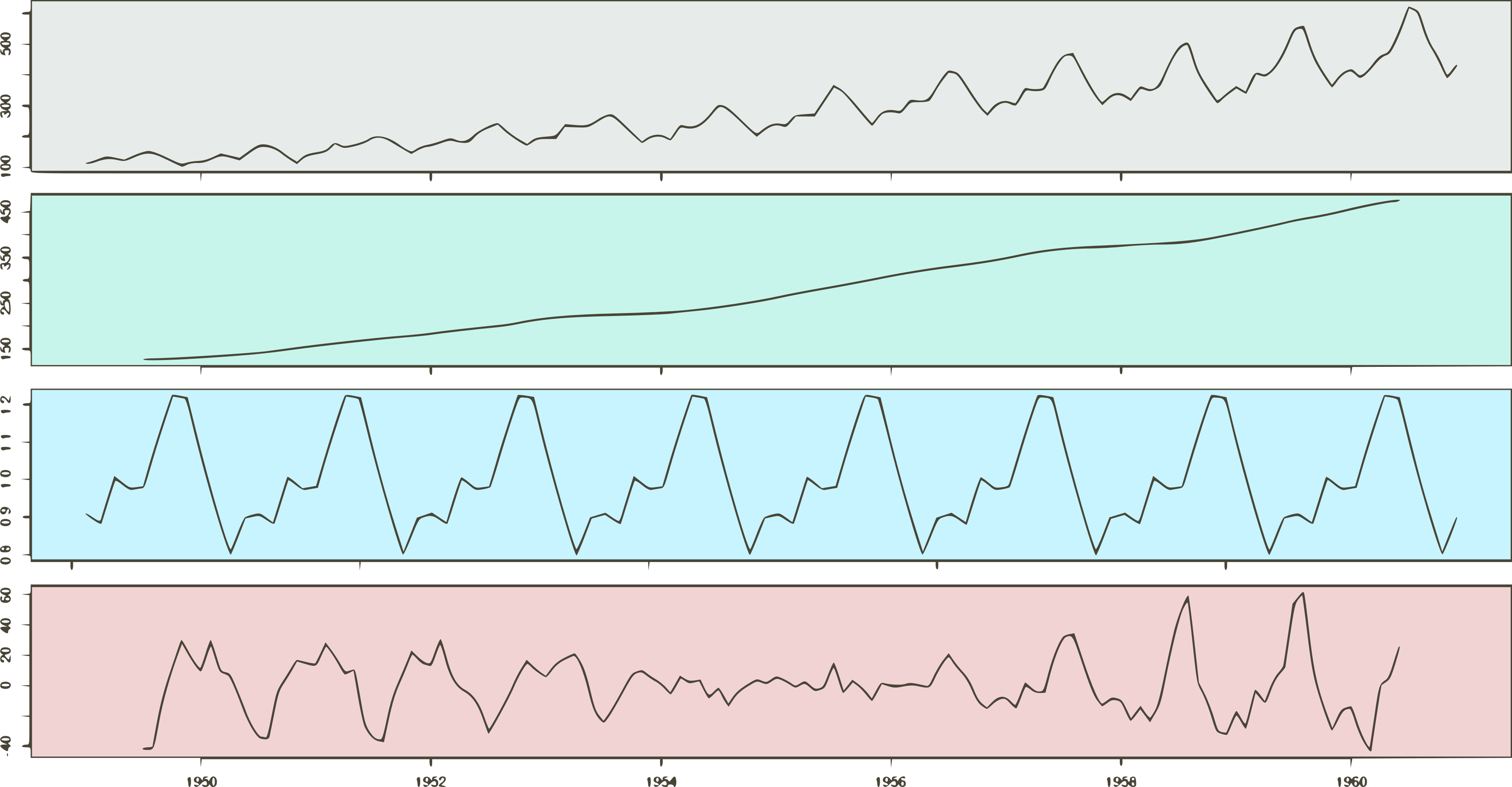
Example of a Seasonal Decomposition. [Source | statsmodels]
https://