Some figures for exploring the relationship between the GMST and Madrid.
Time Series
Time Series (All)
Time Series Period
Block Maximum
Linear Relationship
Non-Linear Relationship
Peaks-Over-Threshold
Linear Relationship
Non-Linear Mean Relationship
Point Process
Relationship
Mean Relationship
Figure 1: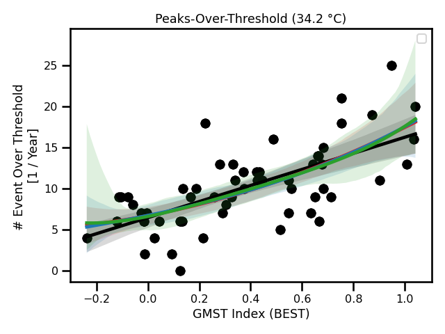 A figure showing a linear regression and polynomial regression fitted to all of the counts of events above the threshold.
Figure 2: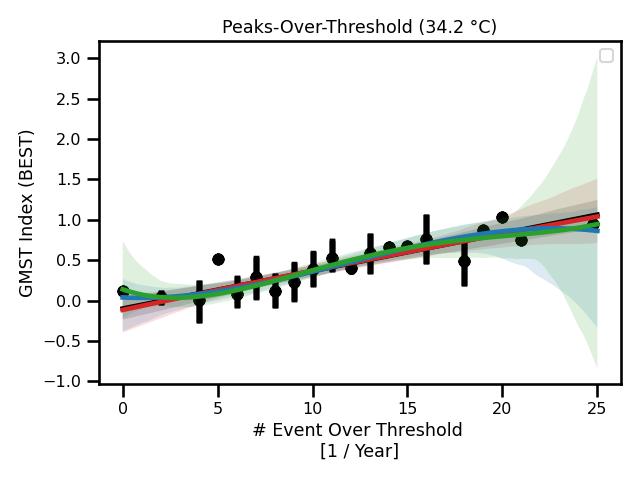 A figure showing a linear regression and polynomial regression fitted to the annual mean number counts of events above the threshold.
The annual mean is the binned observations per year.
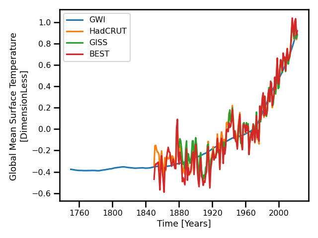 A time series of daily maximum 2m temperature in Madrid.
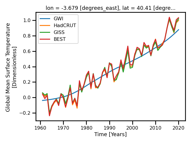 A histogram of daily maximum 2m temperature in Madrid.
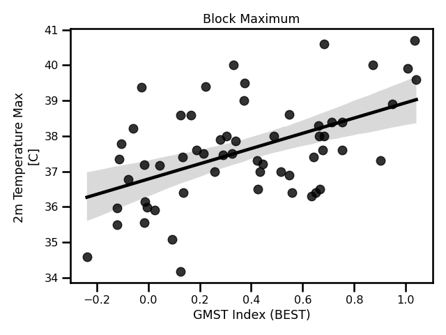 A figure showing a linear regression fitted to the annual maximums per year.
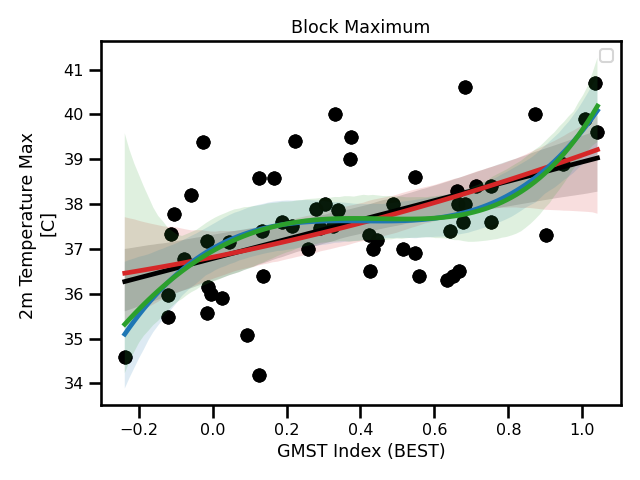 A figure showing a linear regression and polynomial regression fitted to the annual maximums per year.
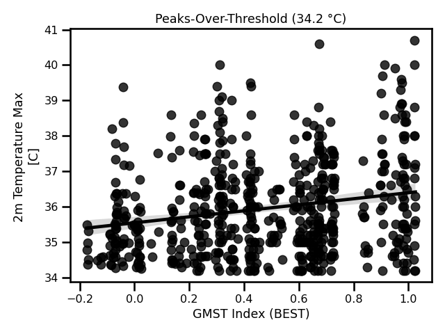 A figure showing a linear regression fitted to all of the counts of events above the threshold.
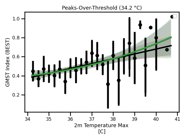 A figure showing a linear regression and polynomial regression fitted to the annual mean events above the threshold.
The annual mean is the binned observations per year.