Data
For this first experiment, we are looking at Madrid
In this figure, we are showing different representations for the time series of Madrid. In Figure 1, there is a daily time series for the 2m max temperature. In Figure 2, there is a histogram for all of the values. Of course, the distribution does not look like any of the traditional distributions from the GEVD (Figure 1). Unless we decide to condition on the seasonal cycle and/or other covariates, then we need to use some extreme value parser, e.g., block maximum or peak over threshold.
Block Maxima
In these examples, we are applying the Block Maxima (BM) method on a yearly basis. So, our block size is of one year which leaves us 62 years in total for our time series. While this is not a lot of data, we see in Figure 5 that the distribution does match one of the classical GEVD distributions. In particular, the Fréchet distribution where the shape parameter, , is less than 0 (Figure 1).
Figure 3: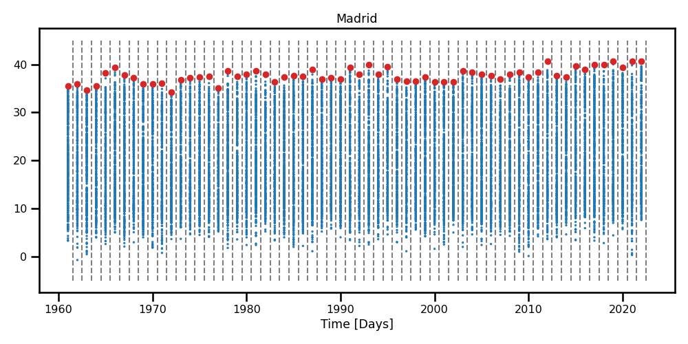 A scatter plot with boundaries for the maximum temperatures obtained using the yearly Block maxima method.
Figure 4: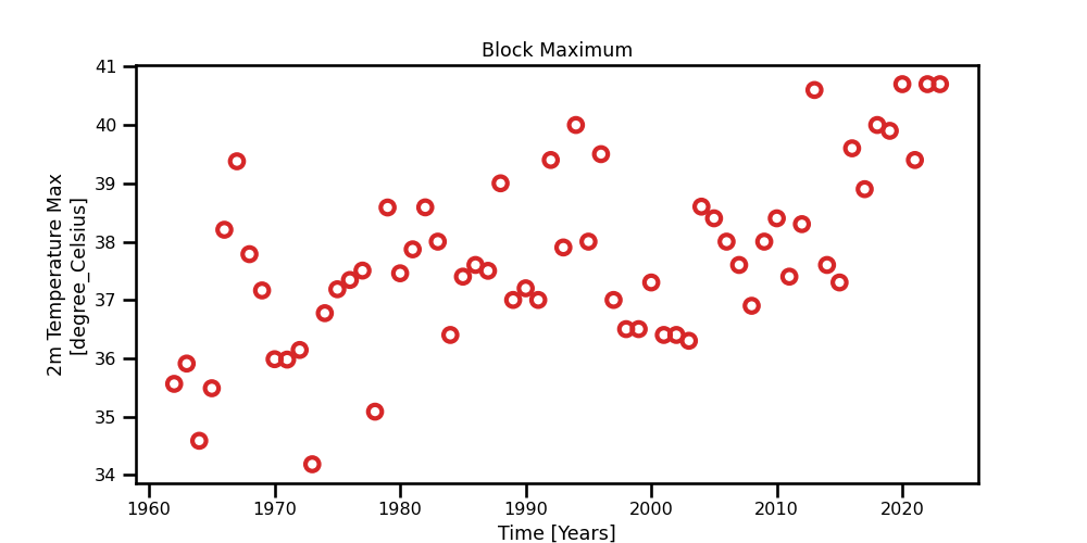 A scatter plot for the yearly maximum values obtained from the daily 2m max temperature for Madrid.
Figure 5: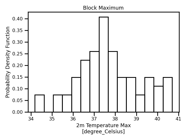 A histogram of all values obtained using the block maxima method.
In this figure, we have different representations for the block maximum method. We already see a trend line and perhaps a hint of cyclic behaviour. In our first experiments, we see will assume a unconditional distribution however we can see that this assumption is incorrect as we can clearly see from Figure 4.
Peak-Over-Threshold
In these examples, we are applying the Peak-Over-Threshold (POT) method with a decluster So, our block size is of 3 days, aka the declustering frequency. In other words, we discretize the time domain to 3 days where we take the maximum value of said 3 days. We see that there is a lot more data available Figure 8 compared to Figure 5. We also see that the distribution does match one of the staple GPD distributions as it has a longer tail.
Figure 6: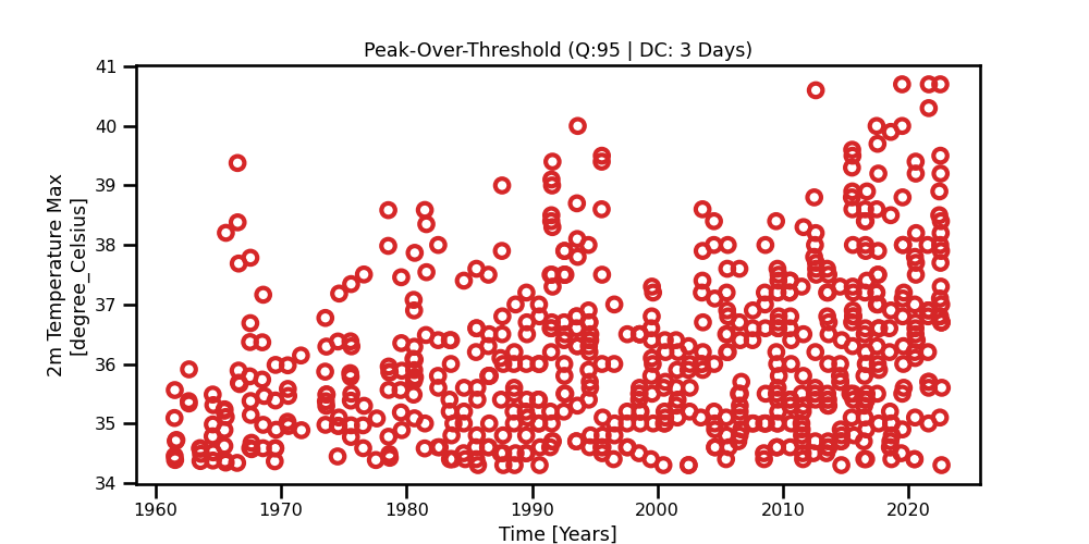 A scatter plot with boundaries for the maximum temperatures obtained using the yearly Block maxima method.
Figure 7: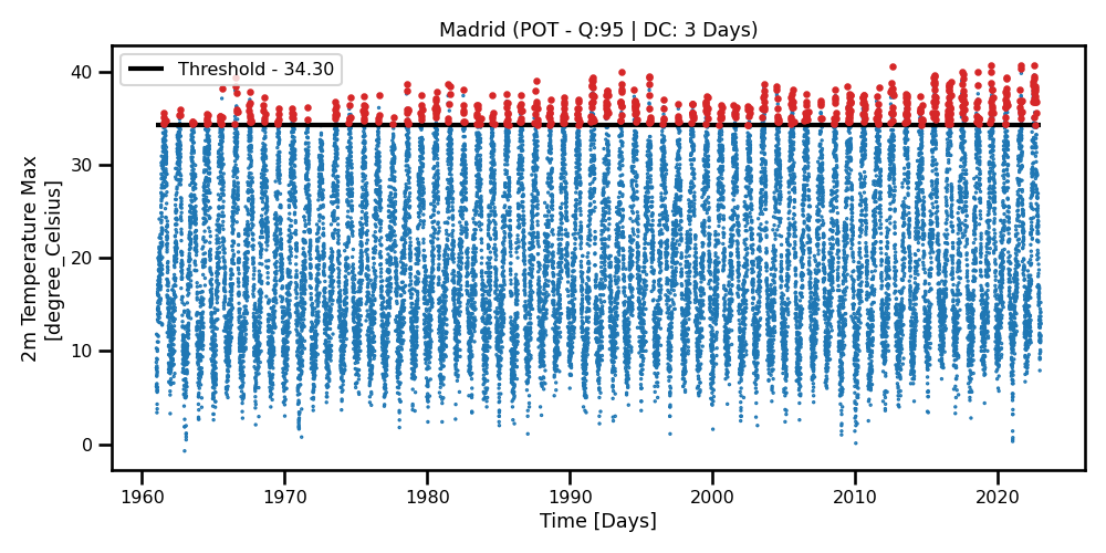 A scatter plot for the yearly maximum values obtained from the daily 2m max temperature for Madrid.
Figure 8: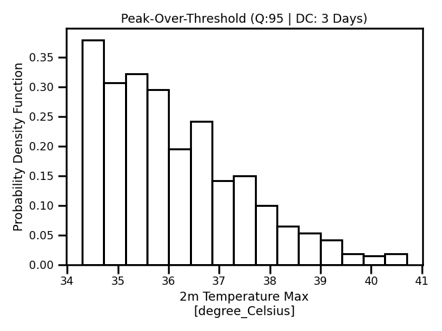 A histogram of all values obtained using the block maxima method.
In this figure, we have different representations for the block maximum method. We already see a trend line and perhaps a hint of cyclic behaviour. In our first experiments, we see will assume a unconditional distribution however we can see that this assumption is incorrect as we can clearly see from Figure 4.
Point Process
In these examples, we are applying the Point-Process (PP) method. Similar to the POT example, our block size is of 3 days, aka the declustering frequency. Again, in other words, we discretize the time domain to 3 days and count any event over the threshold as 1 event. The counts represent the number of events that have surpassed the threshold within a year. We see that there is a lot more data available Figure 8 compared to Figure 5. We also see that the distribution does match one of the staple GPD distributions as it has a longer tail.
Figure 9: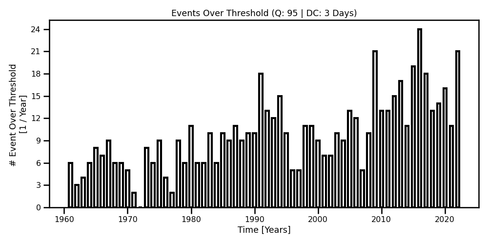 A scatter plot with boundaries for the maximum temperatures obtained using the yearly Block maxima method.
Figure 10: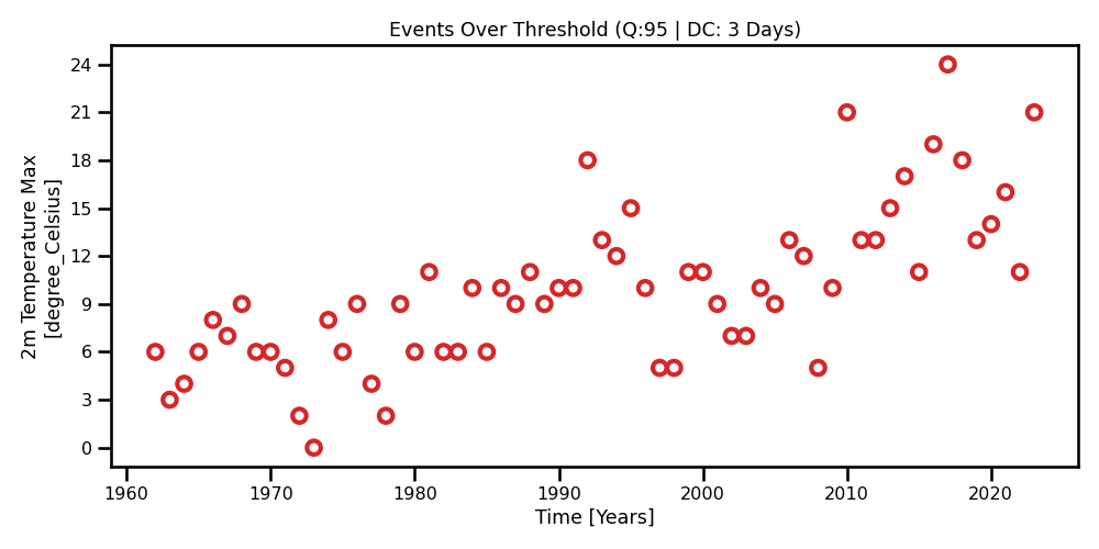 A scatter plot for the yearly maximum values obtained from the daily 2m max temperature for Madrid.
Figure 11: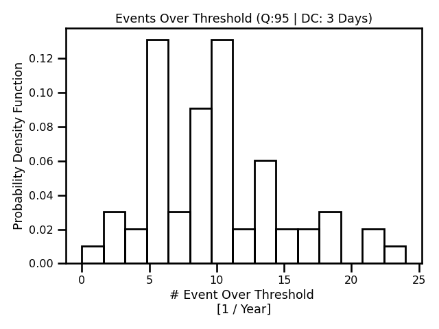 A histogram of all values obtained using the block maxima method.
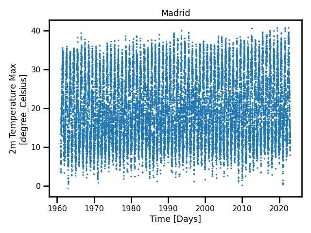 A time series of daily maximum 2m temperature in Madrid.
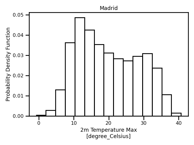 A histogram of daily maximum 2m temperature in Madrid.