The GEV distribution
Modelling, fitting and assessing extremes at a single station
Abstract
With annual maxima in hand, we can finally ask what distribution they follow. Extreme-value theory answers with the Generalized Extreme Value (GEV) family. This notebook develops the GEV in full — density, support, the three tail types, and the return level — then fits it to one station’s annual maxima by Bayesian inference with NumPyro’s NUTS sampler, working through the likelihood, the priors, and the sampler diagnostics. We close by assessing the fit: PP- and QQ-plots, a density overlay, a return-level plot with credible bands, and goodness-of-fit scores (log-likelihood, AIC, BIC, the Kolmogorov–Smirnov statistic, and CRPS).
The GEV distribution at one station
In Block maxima we reduced each station-year to a single annual maximum. Those maxima are not arbitrary numbers: extreme-value theory says they should follow one specific three-parameter family. Here we introduce that family, fit it to a single station, and — just as importantly — check whether it actually describes the data.
Background
The Generalized Extreme Value distribution
The Generalized Extreme Value (GEV) distribution is the limit law for block maxima (the Fisher–Tippett–Gnedenko theorem). Its cumulative distribution function is
with location , scale and shape . Differentiating gives the density
The matters: the GEV has a hard support boundary at . The sign of ξ selects the tail type:
- — Gumbel: light, exponential tail, unbounded both ways;
- — Fréchet: heavy, polynomial tail, lower-bounded;
- — Weibull: short tail with a finite upper bound .
For temperature extremes ξ answers a physical question: is there an effective ceiling on the annual maximum (), or not ()? Once fitted, the model also lets us predict rare levels far beyond the observed record — the return levels of their own section below.
Inference
Given annual maxima assumed i.i.d. GEV, the log-likelihood is
valid where every . Maximising gives the MLE, but with only a few dozen maxima the estimates — especially ξ — are uncertain, so we go Bayesian: with priors the posterior is
and we sample it with the No-U-Turn Sampler (NUTS), a gradient-based MCMC method. We use a tight prior on ξ (weakly informative, mass on ) and a high target acceptance, because the support boundary in ((1)) makes the geometry stiff.
Setup
import sys
import pathlib

try:
    import spatial_extremes  # noqa: F401  installed editable in the project venv
except ModuleNotFoundError:
    _here = pathlib.Path.cwd().resolve()
    _roots = (_here, *_here.parents)
    _cands = [r / "src" for r in _roots]
    _cands += [r / "projects" / "spatial_extremes" / "src" for r in _roots]
    _src = next((c for c in _cands if (c / "spatial_extremes").exists()), None)
    if _src is None:
        raise RuntimeError("cannot locate spatial_extremes/src") from None
    sys.path.insert(0, str(_src))
from __future__ import annotations
import warnings
warnings.filterwarnings("ignore", message=r".*IProgress.*")
import jax
jax.config.update("jax_enable_x64", True) # GEV likelihood is boundary-sensitive
import numpy as np
import pandas as pd
import jax.numpy as jnp
import jax.random as jr
import matplotlib.pyplot as plt
import seaborn as sns
import numpyro
import numpyro.distributions as ndist
from numpyro.infer import MCMC, NUTS
from numpyro.infer.initialization import init_to_median
from xtremax import GeneralizedExtremeValueDistribution as GEV
from xtremax import gev_log_prob
from spatial_extremes import data
from spatial_extremes.places import nearest_city
sns.set_theme(style="whitegrid", context="notebook", palette="deep")maxima, stations, years, is_real = data.load_annual_maxima(min_periods=300, min_years=20)
valid = np.isfinite(maxima).sum(1)
order = valid + np.nan_to_num(np.nanmean(maxima, axis=1)) / 1e3 # covered + warm
sidx = int(np.argmax(order))
lon, lat = float(stations[sidx, 0]), float(stations[sidx, 1])
city, dist = nearest_city(lon, lat)
place = city if dist < 12 else f"near {city}"
mask = np.isfinite(maxima[sidx])
y_np = maxima[sidx][mask]
yr_s = years[mask]
y = jnp.asarray(y_np)
y_mean, y_std = float(jnp.mean(y)), float(jnp.std(y))
print("source:", "REAL CDS" if is_real else "synthetic")
print(f"station at ({lon:.2f}°E, {lat:.2f}°N) — {place}, Spain")
print(f"{y.size} annual maxima, {y_np.min():.1f}–{y_np.max():.1f} °C")source: REAL CDS
station at (0.49°E, 40.82°N) — near Zaragoza, Spain
120 annual maxima, 33.5–43.9 °C
These are the numbers we will model — the annual maximum temperature at this station, one value per year:
fig, ax = plt.subplots(figsize=(10, 4))
ax.scatter(yr_s, y_np, color="#4C72B0", s=34, zorder=3)
ax.axhline(y_np.mean(), color="0.6", ls="--", lw=1, label=f"mean {y_np.mean():.1f} °C")
ax.set(xlabel="year", ylabel="annual maximum (°C)",
       title=f"{place}: annual maximum temperature, {int(yr_s.min())}–{int(yr_s.max())}")
ax.legend()
plt.show()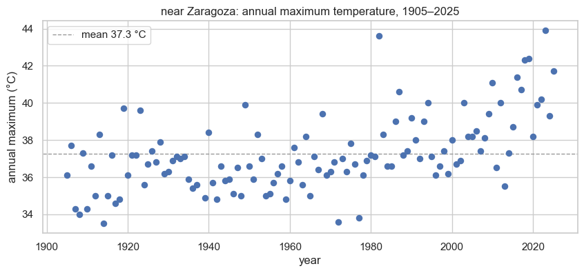
The model
The NumPyro model is a one-to-one transcription of
((4)): three priors and a GEV likelihood ((2)) (xtremax’s
GeneralizedExtremeValueDistribution). The prior means are anchored to the data
scale; the ξ prior is deliberately tight.
def gev_model(obs):
    # priors p(mu, sigma, xi)
    mu = numpyro.sample("mu", ndist.Normal(y_mean, 5.0))
    sigma = numpyro.sample("sigma", ndist.HalfNormal(y_std))
    xi = numpyro.sample("xi", ndist.Normal(0.0, 0.25))      # ~ [-0.5, 0.5]
    # likelihood p(z | mu, sigma, xi)  — eq. (gev-pdf)
    numpyro.sample("obs", GEV(loc=mu, scale=sigma, concentration=xi), obs=obs)
Inference with NUTS
NUTS explores the posterior ((4)) using gradients of
, automatically tuning its trajectory length. We
run two chains so we can check the Gelman–Rubin , raise
target_accept_prob to 0.95 (the GEV support boundary makes the geometry stiff),
and initialise at the prior median.
mcmc = MCMC(
    NUTS(gev_model, target_accept_prob=0.95, init_strategy=init_to_median),
    num_warmup=1500, num_samples=1500, num_chains=2,
    chain_method="vectorized", progress_bar=False,
)
mcmc.run(jr.PRNGKey(0), y)
mcmc.print_summary()
post = mcmc.get_samples()
n_div = int(mcmc.get_extra_fields()["diverging"].sum())
print(f"divergences: {n_div} / {post['mu'].size}")
                mean       std    median      5.0%     95.0%     n_eff     r_hat
        mu     36.36      0.17     36.37     36.07     36.64   1849.06      1.00
     sigma      1.69      0.13      1.68      1.49      1.90   1824.67      1.00
        xi     -0.04      0.06     -0.04     -0.14      0.06   1713.72      1.00

Number of divergences: 0
divergences: 0 / 3000
and a healthy effective sample size on all three parameters mean the chains mixed; a near-zero divergence count means the stiff boundary geometry was handled. Now look at the joint posterior — note how μ and σ trade off, and how wide the ξ posterior is even with a clean fit (the tail type is genuinely hard to pin down from ~25 numbers).
draws = pd.DataFrame({k: np.asarray(post[k]) for k in ("mu", "sigma", "xi")})
g = sns.pairplot(draws, corner=True, diag_kind="kde",
                 plot_kws=dict(s=8, alpha=0.25, edgecolor=None),
                 diag_kws=dict(fill=True))
g.figure.suptitle("Joint posterior  p(μ, σ, ξ | data)", y=1.02)
plt.show()

summary = draws.describe(percentiles=[0.025, 0.5, 0.975]).T[["2.5%", "50%", "97.5%"]]
summary.columns = ["lower 95%", "median", "upper 95%"]
print(summary.round(3).to_string())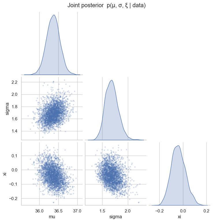
       lower 95%  median  upper 95%
mu        36.020  36.366     36.705
sigma      1.462   1.682      1.954
xi        -0.148  -0.041      0.088
Does the model fit?
A posterior is only useful if the model describes the data. We assess the fit three ways, all built from xtremax’s distribution methods on the posterior-median parameters.
PP- and QQ-plots. Sorting the maxima and using plotting positions , the PP-plot compares the fitted CDF against , and the QQ-plot compares the fitted quantiles against the observed . Points on the diagonal mean a good fit.
mu_m, sig_m, xi_m = (float(np.median(post[k])) for k in ("mu", "sigma", "xi"))
fit = GEV(loc=mu_m, scale=sig_m, concentration=xi_m)

zs = np.sort(y_np)
m = zs.size
p = (np.arange(1, m + 1) - 0.5) / m
cdf_fit = np.asarray(fit.cdf(jnp.asarray(zs)))
q_fit = np.asarray(fit.icdf(jnp.asarray(p)))

fig, (axp, axq) = plt.subplots(1, 2, figsize=(11, 4.6))
axp.plot([0, 1], [0, 1], color="0.5", lw=1)
axp.scatter(p, cdf_fit, color="#C44E52", s=30)
axp.set(xlabel="empirical $p_i$", ylabel=r"fitted $\hat G(z_{(i)})$", title="PP-plot")
lim = [zs.min() - 1, zs.max() + 1]
axq.plot(lim, lim, color="0.5", lw=1)
axq.scatter(q_fit, zs, color="#C44E52", s=30)
axq.set(xlabel=r"fitted quantile $\hat G^{-1}(p_i)$", ylabel=r"observed $z_{(i)}$",
        title="QQ-plot")
fig.tight_layout()
plt.show()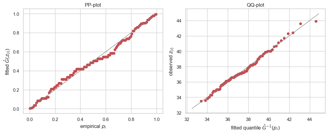
Density overlay. Finally, the fitted density ((2)) should track the histogram of the observed maxima.
grid = jnp.linspace(zs.min() - 2, zs.max() + 4, 250)
fig, ax = plt.subplots(figsize=(6.8, 4.4))
ax.hist(y_np, bins=12, density=True, color="#4C72B0", alpha=0.55, label="annual maxima")
ax.plot(grid, jnp.exp(fit.log_prob(grid)), color="#C44E52", lw=2, label="fitted GEV")
ax.set(xlabel="°C", ylabel="density",
       title=f"Fitted GEV density  (μ={mu_m:.1f}, σ={sig_m:.2f}, ξ={xi_m:+.3f})")
ax.legend()
plt.show()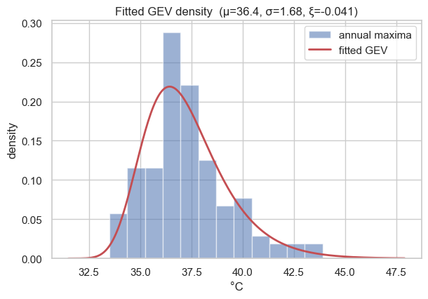
Goodness-of-fit scores. Finally, a few scalar summaries: the maximised log-likelihood ((3)), the information criteria and (), the Kolmogorov–Smirnov statistic , and the continuous ranked probability score (CRPS), estimated from samples of the fitted GEV.
logL = float(jnp.sum(gev_log_prob(y, mu_m, sig_m, xi_m)))
k = 3
aic = 2 * k - 2 * logL
bic = k * np.log(m) - 2 * logL
ks = float(np.max(np.abs(cdf_fit - p)))

# CRPS(F, y) = E|Y - y| - 0.5 E|Y - Y'|, estimated from GEV samples
samp = np.asarray(fit.sample(jr.PRNGKey(7), (5000,)))
e_yz = np.mean(np.abs(samp[:, None] - y_np[None, :]))       # mean over samples & obs
e_yy = np.mean(np.abs(samp[:, None] - samp[None, :]))
crps = float(e_yz - 0.5 * e_yy)

scores = pd.Series({
    "log-likelihood": logL, "AIC": aic, "BIC": bic,
    "KS statistic": ks, "CRPS (°C)": crps,
})
print(scores.round(3).to_string())
log-likelihood -246.697
AIC 499.394
BIC 507.756
KS statistic 0.078
CRPS (°C) 1.102
The diagonal-hugging PP/QQ points, the density tracking the histogram, and a small KS statistic together say the GEV is an adequate model for this station — so we can trust it for the prediction that follows.
Return levels: predicting the rare
Fitting the GEV is not the goal — prediction is. The -year return level is the level the annual maximum exceeds on average once every years; equivalently it is the quantile of the fitted GEV ((1)),
with the Gumbel limit as . Two points deserve emphasis:
- It is extrapolation. From only years of record we routinely read off the 100- or 200-year level — far beyond anything observed. So the uncertainty on is the headline, not the point estimate; the Bayesian posterior hands it to us as a band that widens with .
- The shape ξ drives the extrapolation. For the curve bends toward the finite upper bound ; for it keeps rising. The wide ξ posterior from the fit is exactly why the band fans out at long return periods.
periods = jnp.logspace(np.log10(2), 3, 60)
sub = jr.choice(jr.PRNGKey(3), post["mu"].size, (800,), replace=False)
rl = np.asarray(jax.vmap(lambda i: GEV(loc=post["mu"][i], scale=post["sigma"][i],
                         concentration=post["xi"][i]).return_level(periods))(sub))
rl_med, rl_lo, rl_hi = (np.quantile(rl, q, 0) for q in (0.5, 0.025, 0.975))
emp_T = 1.0 / (1.0 - (np.arange(1, m + 1) - 0.44) / (m + 0.12))   # Gringorten

fig, ax = plt.subplots(figsize=(8, 5))
ax.fill_between(np.asarray(periods), rl_lo, rl_hi, color="#C44E52", alpha=0.2,
                label="95% credible band")
ax.plot(np.asarray(periods), rl_med, color="#C44E52", lw=2, label="posterior median")
ax.scatter(emp_T, zs, color="k", s=24, zorder=5, label="observed maxima")
ax.axvline(m, ls=":", color="0.5")
ax.text(m * 1.05, rl_lo.min(), f"record ≈ {m} yr", color="0.45", fontsize=8)
ax.set_xscale("log")
ax.set(xlabel="return period T (years)", ylabel=r"return level $z_T$ (°C)",
       title=f"{place}: return levels with posterior uncertainty")
ax.legend()
plt.show()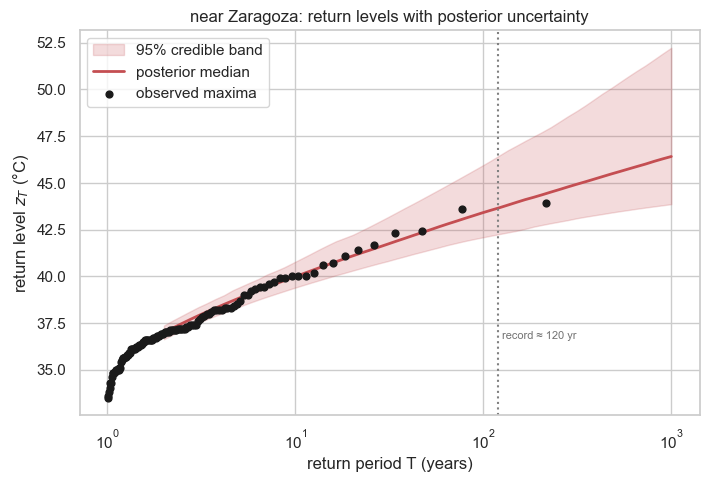
rows = []
for T in (10, 25, 50, 100, 200):
    rT = np.asarray(GEV(loc=post["mu"][sub], scale=post["sigma"][sub],
                        concentration=post["xi"][sub]).return_level(jnp.array(float(T))))
    rows.append((T, np.median(rT), np.quantile(rT, 0.025), np.quantile(rT, 0.975)))
rl_table = pd.DataFrame(rows, columns=["T (yr)", "median °C", "lower 95%",
                                       "upper 95%"]).set_index("T (yr)")
print(rl_table.round(2).to_string())
median °C lower 95% upper 95%
T (yr)
10 39.99 39.40 40.78
25 41.40 40.56 42.67
50 42.43 41.38 44.27
100 43.41 42.09 45.95
200 44.32 42.73 47.66
Drawing those levels back onto the record makes the prediction concrete — the observed maxima cluster around the location μ̂, while the return levels sit progressively further above the data, their bands widening with the return period:
fig, ax = plt.subplots(figsize=(10, 4.8))
ax.scatter(yr_s, y_np, color="#4C72B0", s=34, zorder=5, label="annual maxima")
ax.axhline(mu_m, color="0.4", lw=1.2, label=f"location μ̂ = {mu_m:.1f} °C")
band = sns.color_palette("flare", len(rl_table))
for (T, row), c in zip(rl_table.iterrows(), band):
    ax.axhspan(row["lower 95%"], row["upper 95%"], color=c, alpha=0.10)
    ax.axhline(row["median °C"], color=c, ls="--", lw=1.6,
               label=f"{T}-yr level {row['median °C']:.1f} °C")
ax.set(xlabel="year", ylabel="temperature (°C)",
       title=f"{place}: observed maxima vs predicted return levels")
ax.legend(loc="upper left", fontsize=8, ncol=2)
plt.show()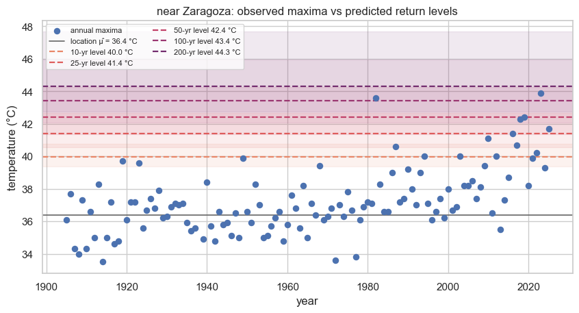
Reading the table: each row is a predicted design temperature and its 95% credible interval, and the interval widens as grows — predicting a 200-year event from a few decades of data is genuine extrapolation. An engineer sizing for heat risk would use the upper bound, not the median. The width also previews why pooling helps: borrowing strength across nearby stations (later notebooks) sharpens ξ and tightens exactly these bands.
Recap & where next
We developed the GEV ((1)), fit it to one station by Bayesian inference ((4)), checked that it fits, and used it to predict return levels with honest uncertainty ((5)). The wide ξ posterior — and the fan-out of the return-level band — flags that estimating tails station-by-station is noisy. In The three extreme-value families we confront that head-on: the three extreme-value families ξ selects are nearly indistinguishable on a single record yet predict very different extremes. Later we pool across stations with a spatial Gaussian process to tame that noise.